Go for a More Relaxed Feel: Low Contrast in Photography
In my last blog, I introduced contrast and highlighted how to take high contrast images. This week we are going to take a look at low contrast images, why they are important, and how to look for them in your photography.
High contrast is extremely valuable in photography because it really makes the image stand out and make a statement.
It can be argued that one should avoid low contrast because the image looks uninteresting and dull. But I would argue that a low contrast image can be just as valuable as a high contrast image, taken in the right context.
For example, imagine a cloudy foggy morning at a pond or lake. As you scan the waters, you notice a group of ducks making their way across the lake. There is no sunrise, so there isn’t any bright light in the background, just the same grey tone covers the whole scene.
What kind of words come to your mind if you were to describe it to a friend? Calm? Restful? Peaceful? Would the same message be conveyed if there were a bright light behind the ducks making the ducks silhouetted and the ripples on the water stand out? I think not.
So now that we have established the need for low contrast in your photography, let’s talk about how to affectively achieve it in your photography:
1. Cut the light. Think a cloudy day, or inside next to a window without direct sunlight, or if you have a tripod, you could look for something in the evening before dusk when there is adequate shade. The key here is that you don’t want a bright light shining on your subject because that will create shadows and we want the tones in this photo to be pretty neutral.

2. Set the light meter lower in order to under expose your image or higher to over expose the image (the image in tip #3 had lowered light). If you set your camera to the Program setting (P), you should be able to control your light meter. On my Canon Rebel, I can select the light meter and use the wheel on the top of the camera to scroll left and lower the light or right to make it brighter.

3. Black and white. I mentioned it with high contrast, but it is also true for low contrast. Cut the color (or perhaps mute it), eliminate those distractions! The image below (using the flowers from tip #1) has a very vintage vibe. This is partly due to the subject, partly due to the muted color, and partly to the low contrast.

4. Set up the scene. In certain conditions, low contrast just make sense. When taking pictures of babies, you can set up the atmosphere so that you have very little contrast. Light colors and light backgrounds make sense and they accentuate the softness of the skin and the innocence that is being represented. Other examples of setting up the scene may be setting up a still life and choosing all dark colored object and a black backdrop. Or perhaps using your macro mode to zoom into an object so that you can only see its texture and nothing in the background.

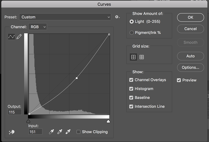
5. Post editing. For low contrast, you could use some of the same tools in Photoshop as you did for high contrast, but create the opposite effect. When you go into curves, create a “C” curve instead of the “S” curve. When you dodge and burn, look to minimize the contrast instead of enhance it.
So mellow down a little this week and look for some low contrast imagery. If you found this article helpful, click the button below and download the FREE project outline for Low Contrast Photography.