There’s only 2 elements left to explore! Today we’re looking at form. This is where you can bring some reality into your designs and artwork; it can turn the flat into the living.
To put it simply, form is something that is or looks 3D. If something has form, it will look like it could exist outside the computer screen or flat surface on which it is presented.
One of my favorite scenes in the movie “Inside Out” is when Joy, Sadness, and Bing Bong go through the “shortcut”. When they go through the abstract thought chamber they start to “deconstruct”. I really love it because it’s like they are moving through the elements of design when the chamber is turned on. They start as organic forms. Then, they turn into geometric forms with various textures with a little value to show dimension. Then, they become two dimensional (shape). And lastly, they become simple lines.
I find it interesting to see the deconstruction of their bodies from form to shape and it really shows how important form is in an artwork (movie, drawing, sculpture, anything!). Watch the clip for yourself and see if you agree!
Anyway, back to our exploration of form. Much like shapes, forms can be either geometric or organic. The definitions are much the same: geometric forms are mathematical and can be named, while organic forms are flowy and curvy and often seen in nature.
When describing geometric shapes, you would say things like: Square, circle, or triangle. When describing geometric forms, you would say: cube, sphere, or pyramid. Choosing to use geometric forms in your artwork, designs or images can make the result look rigid or possibly strong and forbidding.
Organic forms are seen almost everywhere, especially in nature. From flowers, to clouds, to the human figure itself, organic forms are prevalent. Choosing to use organic forms in your artwork, designs, or images can make the result look rather free flowing and possibly open ended.
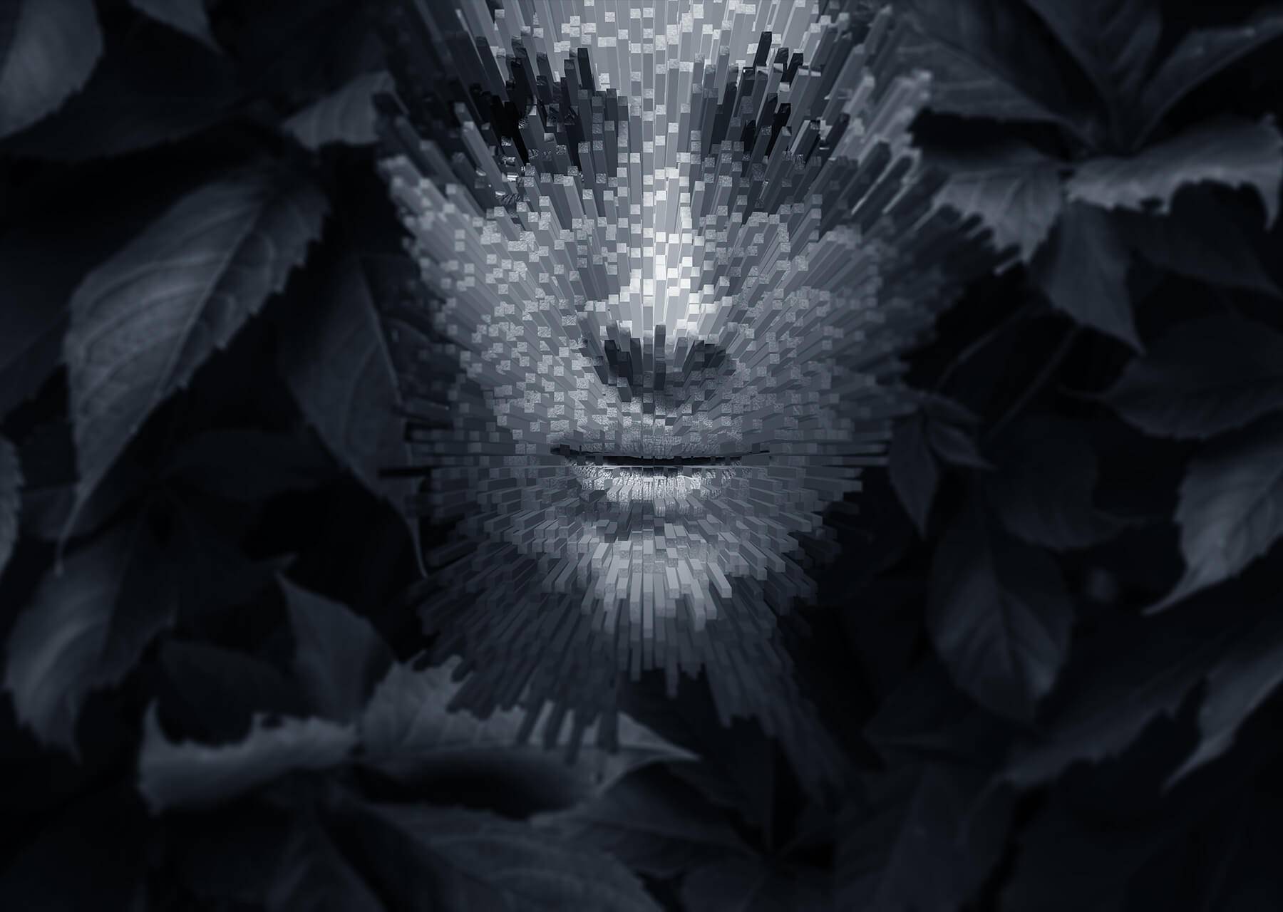
Digital Art: Jyo John Mulloor
This is the second time that I have highlighted Mulloor in this series, but as a digital artist, I really appreciate his work! In this case, he has some very interesting ways to display his forms.

A human face is meant to be smooth and organic. But what happens when you change that organic form into a geometric form? No doubt this is the exact question that Mulloor posed to himself when he created the image above. In a series he made titled “Extrude Art” he distorted the human face with these rigid geometric architectural columns. The result? They look…well… a lot less human!

The closeness of the female face with the fish in the image above implies some kind of relationship. As organic forms, they have a natural visual relationship. The repeated colors within the face and in the fish emphasize this. While the similar forms create a kind of unity, the dark values used and the subjects chosen create a sense of mystery.
Graphic design: Lauren Peters-Collaer
Form is used less in graphic design because usually, you want to make your designs as simple as possible and forms, while helping make a design realistic, can complicate the design. There are some cases, however, where you might see a form in a graphic design. Check out the book covers below!

GEOMETRIC: Lauren Peters-Collaer designed the cover for the book Tokyo Ueno Station. This book traces the life of a man who begins with great hope but ultimately loses everything and becomes homeless. The book cover design uses a combination of shapes and geometric forms. I think the use of forms and geometric shapes show the downward spiral of the man’s life. The shapes and forms seem disorganized and disjointed which contrasts with the appearance of geometric forms which should represent order and progress.

ORGANIC: Peter-Collaer’s design cover for Helen Oyeyemi’s book Peaces is quite different in style from the last one. The collage style of the organic forms used on the book cover do a great job of symbolizing the book’s weird storylines which highlight a train ride where many strange and whimsical things happen to the two main characters. The organic forms used on the cover seem a bit random and odd, but they make perfect sense once one reads the novel’s strange series of events.
Photography: Sergio Larrain

GEOMETRIC: It can be hard to see geometric forms in photography if you are not looking for them. However, when you do, it is interesting to see exactly how much you see them! I love the way Sergio Larrain used the geometric form of a framed mirror to display a snapshot of someone’s life. It’s like they are being displayed as an artwork on the wall.

ORGANIC: Similar to the way that the mirror is used to frame the photographic moment in the photo above, the girl seems to frame the haphazard street behind her. Her organic shape stands out from the geometric forms of the houses behind her.
Download the FREE reflection worksheet that goes along with this article below. This reflection is available in both Word and Google Doc; click the button below and enter your email!
